![EdApp - logo dark mode-1.png]](https://support.edapp.com/hs-fs/hubfs/EdApp%20-%20logo%20dark%20mode-1.png?height=40&name=EdApp%20-%20logo%20dark%20mode-1.png)
Cascading Style Sheet (CSS) describes how HTML elements will be displayed on a screen, paper, or other media. If you’re modifying colors, font types, font sizes, images, element positioning, and more, CSS is the tool for the job!
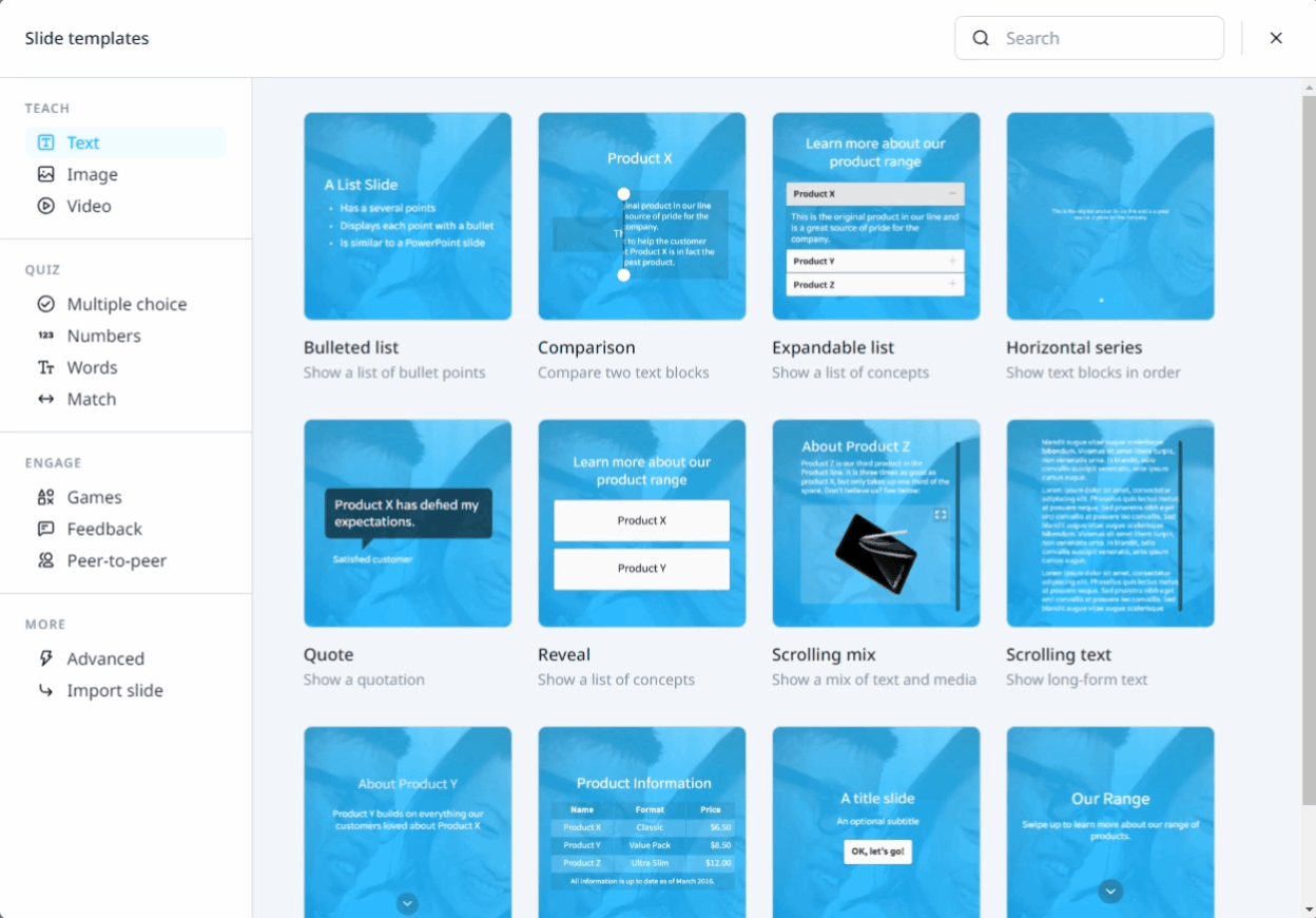
TEMPLATE SPECIFIC ELEMENTS
- TEACH
- TEXT TEMPLATES
- IMAGE TEMPLATES
- VIDEO TEMPLATES - QUIZ
- MULTIPLE CHOICE
- NUMBER TEMPLATES
- WORDS TEMPLATE
- MATCH TEMPLATES - ENGAGE
- GAMES TEMPLATES
- FEEDBACK TEMPLATES
-png.png?width=20&height=20&name=Untitled%20design%20(14)-png.png) CSS ANATOMY
CSS ANATOMY 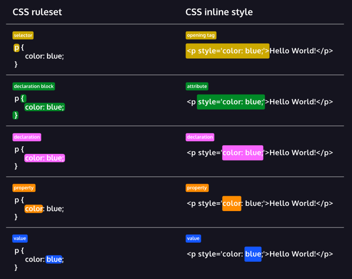
© Screenshot from Codeacademy
Always double-check if no curly bracket or semicolon is missing, as it could make other CSS syntax, not work.
💡 COURSE ELEMENTS 💡
Below are selectors and rulesets for the general elements across a course. Be guided by using these colors:
root {

--main-color:#223042; /* dark blue /

--accent-color:#00BAFF; / light blue*/

}
TEMPLATE |
RULESET |
|---|---|
|
All Buttons |
btn.btn { |
|
Solid Buttons |
.btn.btn-solid { |
|
Progress Bar |
#indicator { |
|
Page Counter |
#lesson-header-nav { |
|
Menu Button |
#lesson-header-nav-menu-btn { |
|
Top Block Header |
#lesson-header { |
|
Lesson Title & Line at the Top |
#lesson-header-title-content { |
|
Line at the Bottom |
#slides { |
|
Selected Buttons for all Quiz Templates |
.selectable.active .btn {
|
|
Answer Box |
#slide-answer { |
|
Continue Button in Answer Box |
#slide-answer-continue { |
|
General Font for the entire course |
#slides-view {
|
|
Headings |
h1, h2, h3, h4, h5 { |
|
List Bullet Points |
li::before { |
|
‘OK, I’m ready!’ Button |
btn.btn-solid.play-game { |
|
Exit Button |
.slide-exit .btn.btn-solid.slide-up { |
🛠️ WORKAROUNDS 🛠️
Below are some workarounds for the common irksome behaviors we encounter in the day-to-day.
Template |
Ruleset |
|---|---|
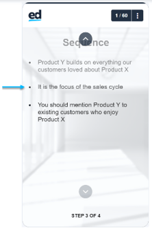
Arrow up in Sequence and Vertical Series hitting the block header. 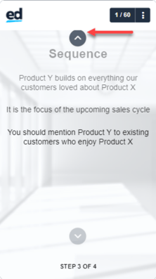 |
.slide-text-sequence .btn-up {
.slide-image-slider .btn-up { 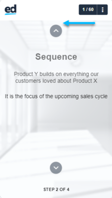 You may adjust the value according to your liking.
|
The Bottom caption box hits the arrow down.  |
.slide-image-slider .caption.position-bottom {
|
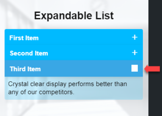
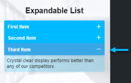
A box around the active symbol in Expandable List due to the brand inheritance/color scheme.
|
.slide-expandable-list .item.active .item-button:after {
|
Broken thumbnail in YouTube template  |
.slide-youtube-video-embed .yt-thumb {
.slide-youtube-video-embed .yt-thumb {
Choose one image that will be used for all the YouTube slides. Make sure it’s hosted from a secured website. |
Inconsistent indention of the bulleted list and numbered list in Sequence. 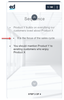 |
.slide-text-sequence .text-center ul {
.slide-text-sequence .text-center ol {
.slide-text-sequence ol.md-list>li:before {
|
Inconsistent indention and color of “Number 1” in the Scrolling Mix.
|
.slide-scrolling-media ol.md-list>li:before {
|
Bullet points in Scrolling Mix are being cut. |
.slide-scrolling-media ul.md-list {
By default, bullet points are working fine. This happens when the imported font is added in the custom CSS, wherein it’s not possible for us to get rid of. |
|
#slides-background {
transition-timing-function: unset!important; |
|
Add the following property and value to the corresponding selector of the template: text-transform: none;
|
|
#lesson-header-title-content {
content-visibility: hidden; |

🔎 TEMPLATE-SPECIFIC ELEMENTS 🔍
TEACH ✏️
TEXT TEMPLATES
Below are selectors and rulesets for the Text Templates for TEACH. Be guided by following these colors:
root { --main-color:#223042; /* dark blue */

--accent-color:#00BAFF; /* light blue*/

}
Template |
Ruleset |
|---|---|
 |
.slide-text-sequence .btn-up {
.slide-text-sequence .btn-down {
.slide-text-sequence .btn-down:hover, .slide-text-sequence .btn-up:hover {
By default, the arrow up and down buttons follow the value of the colors set in .btn.btn. It’s up to you to change them, like what the codes above display. |
|
.slide-expandable-list .btn.btn-solid {
.slide-expandable-list .btn.btn-solid:hover {
.slide-expandable-list .item.active .item-button {
.slide-expandable-list .item.active .item-content {
.slide-expandable-list .item-button:after {
.slide-expandable-list .item.active .item-button:after {
Due to the brand inheritance, a box following what’s set in the color scheme surrounds the symbol. As a workaround, add a background: transparent. |
 |
.btn-reveal-title.btn.btn-solid.flippable {
.slide-reveal .btn-reveal.active .btn-reveal-desc.flippable { By default, the block's radius will follow the value set in .btn.btn.solid. Unless you declare a different value to change it. Refer to the codes above to see the difference. |
|
.slide-speech-bubble .quote.quote-dk .quote-bg {
.slide-speech-bubble .quote.quote-dk {
.slide-speech-bubble .quote.pull-left.quote-dk:after {
.slide-speech-bubble .quote.pull-right.quote-dk:after {
.slide-speech-bubble .quote.quote-lt .quote-bg {
.slide-speech-bubble .quote.quote-lt {
.slide-speech-bubble .quote.pull-left.quote-lt:after {
.slide-speech-bubble .quote.pull-right.quote-lt:after {
|
 |
.slide-list ::marker {
|
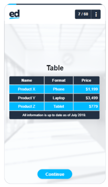 |
.slide-table .table-row:nth-child(odd) {
background: var(--main-color);
.slide-table .table-row:nth-child(even) {
|
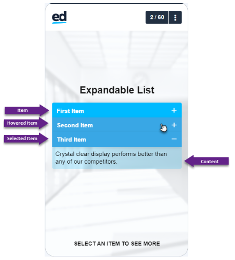
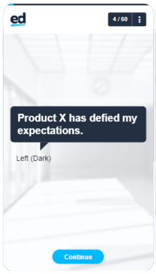
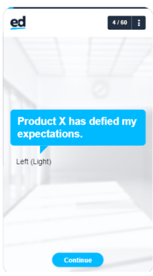
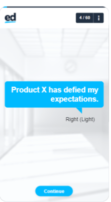
IMAGE TEMPLATES
Below are selectors and rulesets for the Image Templates for TEACH. Be guided by following these colors:
root { --main-color:#223042; /* dark blue /

--accent-color:#00BAFF; / light blue*/

}
Template |
Ruleset |
|---|---|
|
Caption Box (Default) .slide-image-slider .style-default .caption-content {
Caption Box (Dark) .slide-image-slider .style-dark .caption-content {
Caption Box (Light) .slide-image-slider .style-light .caption-content {
Button Up .slide-image-slider .btn-up {
background: #223042; Button Down .slide-image-slider .btn-down {
Buttons Up and Down when hovered .slide-image-slider .btn-down:hover, .slide-image-slider .btn-up:hover {
Arrow Up .icon-chevron-up:before {
Arrow Down .icon-chevron-down:before {
|
|
Page when visited .slide-image-gallery .pagination .dot.active {
Page when not visited .slide-image-gallery .pagination .dot {
|
|
Block .slide-image-collection .tappy-child {
Block when visited .slide-image-collection .tappy.visited .tappy-child {
|
|
.slide-comparison .slider-knob {
.slide-comparison .slider-knob:before {
.slide-comparison .slider-knob:after {
.slide-comparison .slider {
|
|
.slide-scratch-to-reveal.state-touched .btn-replay {
|
|
.slide-image-map.waypoint-white .waypoint {
.slide-image-map.waypoint-black .waypoint {
.slide-image-map.is-loaded .waypoint.tapped {
|
|
.slide-image-waypoints.guided-false .waypoint:after {
}
.slide-image-waypoints.guided-false .waypoint.tapped:after {
}
.slide-image-waypoints.waypoint-white .waypoint:before {
.slide-image-waypoints.waypoint-white .waypoint:hover:before {
.slide-image-waypoints.waypoint-white .waypoint:hover:before {
|
|
.slide-image-waypoints .prev-wp, .slide-image-waypoints .next-wp {
}
.icon-chevron-left:before {
.icon-chevron-right:before {
|
|
.slide-scrolling-media.image-focus-true .multi-content-wrapper-image:after {
.slide-scrolling-media img.multi-content {
|
|
.slide-image .img-compose {
.pswp__item {
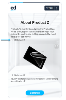
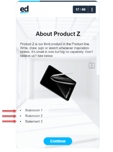
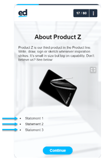
This code also applies when you click and zoom an image on Scrolling Mix. |
|
.slide-media-collection .tappy .tappy-child {
.slide-media-collection .tappy.visited .tappy-child {
|
VIDEO TEMPLATES
Below are selectors and rulesets for the Video Templates for TEACH. Be guided by using these colors:
root {

--main-color:#223042; /* dark blue /

--accent-color:#00BAFF; / light blue*/

}
Template |
Ruleset |
|---|---|
|
.video-js .vjs-tech {
background: white;
.video-js .vjs-big-play-button {
.video-js .vjs-big-play-button:before {
|
|
.slide-video-collection .tappy-child.dark:before {
.slide-video-collection .tappy.visited .tappy-child {
.slide-video-collection .thumb-content {
|
|
.video-play, .video-replay {
.video-play.__active, .video-replay.__active {
.video-play:before, .video-replay:before {
.slide-youtube-video-embed .yt-thumb {
|
|
The Play Button and Icon used on YouTube are the same as the Vimeo template
.vimeo-thumb.content-ver {
|
-
QUIZ 📚
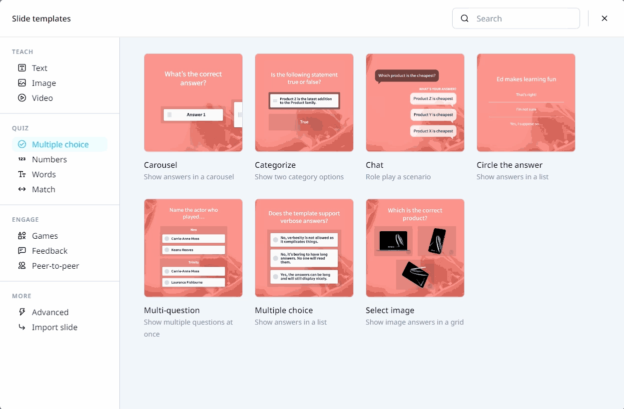
MULTIPLE CHOICE TEMPLATES
Below are selectors and rulesets for the Multiple Choice Templates for QUIZ. Be guided by using these colors:
root {

--main-color:#223042; /* dark blue /

--accent-color:#00BAFF; / light blue*/

}
Template |
Ruleset |
|---|---|
|
.slide-multiple-choice-game .selectable.active .btn {
.slide-multiple-choice-game.state-complete .selectable.correct .btn {
.slide-multiple-choice-game.state-complete .selectable.incorrect .btn {
.slide-multiple-choice-game .selectable .btn:before {
.slide-multiple-choice-game .selectable.active .btn:before {
.slide-multiple-choice-game .selectable.active .btn:after {
.slide-multiple-choice-game .block-dk {
|
|
.slide-circle-the-answer .circle-box.active .circle-box-text {
.slide-circle-the-answer.state-complete .circle-box.active.incorrect {
|
|
.slide-chat .message--question {
.slide-chat .message--question:after {
.slide-chat.show-msg-true .selectable {
.slide-chat.show-msg-true .selectable:after {
.slide-chat.show-msg-true .selectable.active {
.slide-chat.show-msg-true .selectable.active:after {
.slide-chat.state-complete .chat-msg.correct {
.slide-chat.state-complete .chat-msg.correct:after {
.slide-chat.state-complete .chat-msg.incorrect {
.slide-chat.state-complete .chat-msg.incorrect:after {
|
|
.slide-matrix.game-slide .selectable.active .btn {
.slide-matrix.game-slide .block-dk {
.slide-matrix.game-slide .selectable .btn:before {
.slide-matrix.game-slide .selectable.active .btn:before {
.slide-matrix.game-slide .selectable.active .btn:after {
|
|
.slide-categorise .droppy.active .droppy-child {
.slide-categorise.state-complete .droppy-true.active .droppy-child {
.slide-categorise.state-complete .droppy-false.active .droppy-child {
.slide-categorise .btn-text {
.slide-categorise .droppy {
.slide-categorise .droppy-child.block-dk.text-center.text-lg.slide-left, .slide-categorise .droppy-child.block-dk.text-center.text-lg.slide-right {
|
|
.slide-image-multiple-choice .tappy.active {
.slide-image-multiple-choice.state-complete .tappy.correct {
.slide-image-multiple-choice.state-complete .tappy.incorrect.active {
.slide-image-multiple-choice .tappy-selection {
.slide-image-multiple-choice .tappy.active .tappy-selection {
.slide-image-multiple-choice .tappy.active .tappy-selection:after {
|
|
.slide-carousel .block-dk {
.slide-carousel .carousel-item:before {
.slide-carousel .pagination .page.active {
.slide-carousel .pagination .page {
|
NUMBER TEMPLATES
Below are selectors and rulesets for the Number Templates for QUIZ. Be guided by following these colors:
root {

--main-color:#223042; /* dark blue /

--accent-color:#00BAFF; / light blue*/

}
Template |
Ruleset |
|---|---|
|
.slide-dial .dial-ring {
.slide-dial .dial-knob {
.slide-dial.dial-knob-value{
.slide-dial .dial-knob-value:after {
|
|
.slide-dial-distribution .dial-ring {
.slide-dial-distribution .dial-knob {
.slide-dial-distribution.dial-knob-value{
.slide-dial-distribution .dial-knob-value:after {
|
|
.slide-pie-chart .pie-ring {
The color to be set here should have an adjusted opacity. Do not use full solid color.
.slide-pie-chart .pie-ring-value {
|
|
.slide-ratio .ratio-bar {
.slide-ratio .ratio-bar-container {
.slide-ratio .ratio-value-amount {
|
|
.slide-slider .slider-knob {
.slide-slider .slider-bar {
.slide-slider .slider-notch:before, .slide-slider .slider-notch:after {
.slide-slider .slider-knob-value {
.slide-slider .slider-knob-value:after {
|
WORDS TEMPLATES
Below are selectors and rulesets for the Words Templates for QUIZ. Be guided by following these colors:
root {

--main-color:#223042; /* dark blue /

--accent-color:#00BAFF; / light blue*/

}
Template |
Ruleset |
|---|---|
|
.slide-missing-word .fade-in {
Use the above code if your texts are in uppercase, and you want to change it to lowercase.
.slide-missing-word .draggy {
.slide-missing-word .block-dk {
|
|
.slide-strikeout .fade-in {
|
|
.slide-construct .statement {
.slide-construct.game-playing .letter {
.slide-construct .block-dk {
|
|
.slide-construct-sentence .droppy-container {
.slide-construct-sentence .draggy .btn {
.slide-construct-sentence .block-dk {
|
MATCH TEMPLATES
Below are selectors and rulesets for the Match Templates for QUIZ. Be guided by following these colors:
root {

--main-color:#223042; /* dark blue /

--accent-color:#00BAFF; / light blue*/

}
Template |
Ruleset |
|---|---|
|
.slide-connect .connect-box {
.slide-connect .connect-box.active {
.slide-connect .connect-box.complete {
|
|
.slide-drag-to-match .draggies .block-dk {
.slide-drag-to-match .droppy-zone {
|
|
.slide-reorder.ready .draggy .btn:before {
.slide-reorder.ready .draggy-container {
.slide-reorder.ready .btn.btn-solid.btn-block {
|
|
.slide-image-pair .image-container {
.slide-image-pair .image-container.left:after, .slide-image-pair .image-container.right:after {
|
|
.slide-tap-in-order .tappy-child {
.slide-tap-in-order .tappy.active .number {
|
ENGAGE 🎮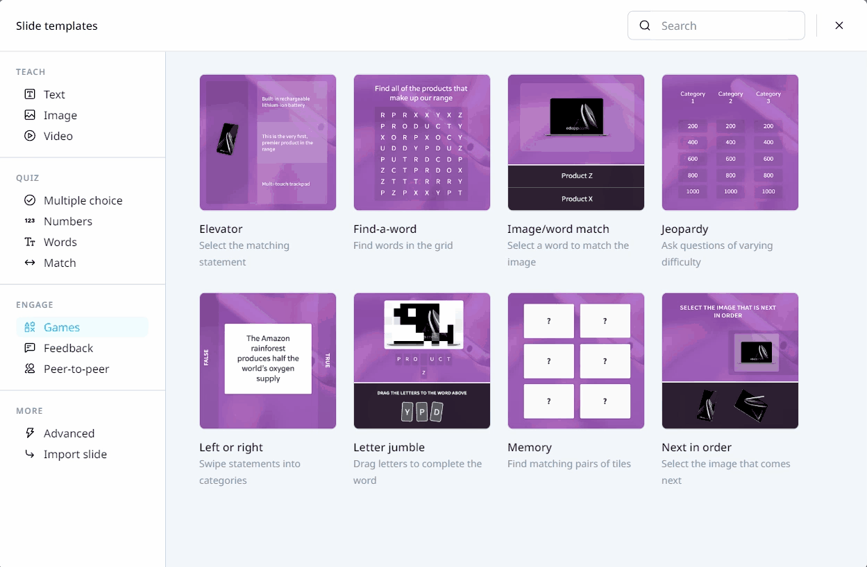
GAMES TEMPLATES
Below are selectors and rulesets for the Games Templates for ENGAGE. Be guided by using these colors:
root {

--main-color:#223042; /* dark blue /

--accent-color:#00BAFF; / light blue*/

}
Template |
Ruleset |
|---|---|
|
.slide-game-true-or-false .game-statement {
.slide-game-true-or-false .game-false {
.slide-game-true-or-false .game-true {
.slide-game-true-or-false .game-false.active {
.slide-game-true-or-false .game-true.active {
|
|
.slide-game-image-word-match .btn-word {
.slide-game-image-word-match .btn-word.__active {
.slide-game-image-word-match .multi-content-text {
.slide-game-image-word-match .match-image-container {
|
|
.slide-game-memory .btn.btn-solid {
.slide-game-memory .btn.btn-solid:hover {
|
|
.slide-game-jumble .jumble-letters {
.slide-game-jumble .draggy .letter {
.slide-game-jumble .draggy.active .letter {
.slide-game-jumble .draggy.active-pos.is-positioned .letter {
.slide-game-jumble.active .letter {
|
|
.slide-find-a-word .grid-container {
.slide-find-a-word .grid-highlight.complete {
|
|
.slide-game-next-in-order .next-options {
.slide-game-next-in-order .next-sequence.block-dk.block-sm {
|
|
.slide-game-elevator .block-dk.content-fill {
.slide-game-elevator .direction-column {
|
|
.slide-game-jeopardy .block-md.block-dk {
.slide-game-jeopardy .game-category-title {
|
FEEDBACK TEMPLATES
Below are selectors and rulesets for the Feedback Templates for ENGAGE. Be guided by using these colors:
root {
--main-color:#223042; /* dark blue /
--accent-color:#00BAFF; / light blue*/
}
Template |
Ruleset |
|---|---|
|
.icon.icon-pencil {
.icon-pencil:before {
#text-input-view #text-input-prompt {
|
|
.active.slide-slider-survey .slider-knob-input {
.slide-slider-survey .slider-bar {
.slide-slider-survey .slider-notch:before, .slide-slider-survey .slider-notch:after {
.slide-slider-survey .slider-knob-value {
.slide-slider-survey .slider-knob-value:after {
.slide-slider-survey .slider-label-min, .slide-slider-survey .slider-label-max {
.slide-slider-survey .slider-label-min:after, .slide-slider-survey .slider-label-max:after {
|
|
.slide-multiple-choice-survey .btn.btn-solid {
.slide-multiple-choice-survey .selectable .btn:before {
.slide-multiple-choice-survey .selectable.active .btn:before {
.slide-multiple-choice-survey .selectable.active .btn:after {
|
|
.slide-quadrant-survey .btn.btn-solid {
.slide-quadrant-survey .slide-content .quadrant .quadrant-zone {
.slide-quadrant-survey .slide-content .quadrant .quadrant-zone:nth-child(1) {
.slide-quadrant-survey .slide-content .quadrant .quadrant-zone:nth-child(2) {
.slide-quadrant-survey .slide-content .quadrant .quadrant-zone:nth-child(3) {
.slide-quadrant-survey .slide-content .quadrant .quadrant-zone:nth-child(4) {
|
 Reference Websites
Learn more about CSS: CSS Tutorial
CSS Gradient:  CSS Gradient — Generator, Maker, and Background
CSS Shapes: CSS Clip-Path Generator - CSS Portal
Introduction to CSS Course:  Learn CSS