![EdApp - logo dark mode-1.png]](https://support.edapp.com/hs-fs/hubfs/EdApp%20-%20logo%20dark%20mode-1.png?height=40&name=EdApp%20-%20logo%20dark%20mode-1.png)
The Image Waypoints template allows you to choose a source image, then choose “regions” of the image which you can zoom in to see more closely.
Each region can also have its own written caption which appears when you zoom in. The template allows you to add a caption that is not included in the source image.
There are two main ways users can interact with this template:
- Guided - when this box is ticked, the user starts on the first waypoint region and clicks arrows to proceed through the rest of the regions.
- Unguided - Clickable buttons appear which show the user where the different regions are on the source image, and the user can select the regions in any order they prefer.
TIP: For Guided Waypoints, make the first region the whole image, so the entire image is shown before the user clicks the arrow to zoom into smaller regions of the image.
What can Image Waypoints be used for?
This template can be used for different types of images, maps, and diagrams.
For example, some possible uses include:
- An image of an object, and you zoom in on each part of the object (as in flower image below) (e.g. parts of machinery, furniture, jewelry, buildings)
- A map, and you zoom in to each area (e.g floor plan, geographical map, map of functions of a business)
- A sequence or process flow diagram, and you zoom in on each step (steps in the evacuation plan, the order to build something, actions to take in a sales process)
Steps to Configure Image Waypoints
- Upload an image in the Image section of the template (or select Design on Canva to select one from the Canva library).
- Select Edit Region and choose the region of the main image you want to zoom in to.
- Add complementary text to the region in the Caption section underneath.
- Repeat for more regions of the image.
TIP: Consider whether any existing diagrams which have previously been viewed in a slide presentation or PDF could be reformatted to be more suitable for vertical viewing on a mobile device.
Settings
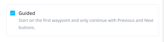
Guided vs Unguided (unticked)
When the guided box is ticked, a user must click the arrows to move through the regions in a sequence. When it is not ticked, a user can click on the regions in any order.
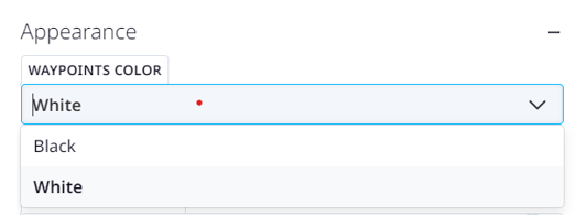
Appearance - Waypoints Color
Choose whether the clickable regions have a white button or black button (Unguided Waypoints only).
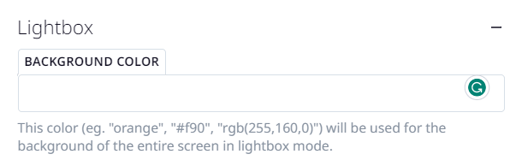
Lightbox - Background Color
Choose whether the caption box or arrows have a background color (the default is black).
You can also add RGB and Hex codes, or write “none” or “transparent” here if you don’t want a background color.
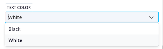
Text Color
Choose whether you want a black or white text for the captions.