![EdApp - logo dark mode-1.png]](https://support.edapp.com/hs-fs/hubfs/EdApp%20-%20logo%20dark%20mode-1.png?height=40&name=EdApp%20-%20logo%20dark%20mode-1.png)
Add your brand colors at an account level
1. Head to App settings > Content > Default Theme
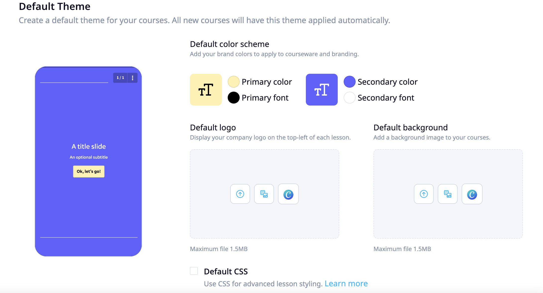
Colour scheme includes:
- Primary color
- Primary font
- Secondary color
- Secondary font
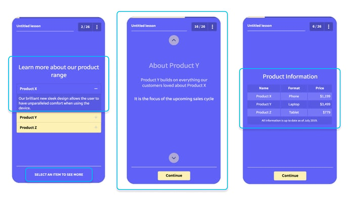
Adding your brand colours will reflect throughout your content. See examples of where these colours show below.
Primary color
- Progress indication
- Primary interactions
- Buttons
- Lesson navigation
Primary font
- Primary interactions font
- Button font

Secondary color
- Background color (if no image applied)
- Secondary interactions
Secondary font
- Header
- Paragraph/body
- Secondary interactions
Color scheme editing is also available to be edited on a per-course/lesson basis. More on how to do that HERE.