![EdApp - logo dark mode-1.png]](https://support.edapp.com/hs-fs/hubfs/EdApp%20-%20logo%20dark%20mode-1.png?height=40&name=EdApp%20-%20logo%20dark%20mode-1.png)
Overview
CSS, which is short for Cascading Style Sheets, is a programming language that tells your device or browser how to display your lesson content. It can be used to control the different elements of your lesson such as fonts and buttons. This means you can add your personal flair or your company’s brand aesthetics to your lessons to create that ‘Wow’ factor for your learners.
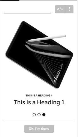
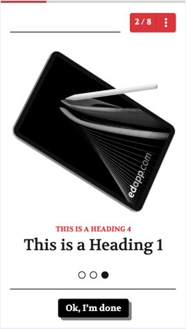
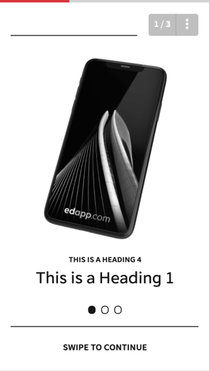
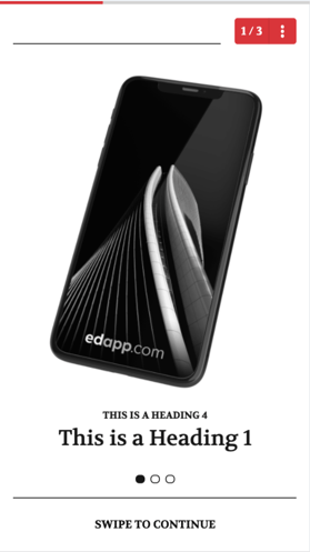
In this guide, we’ll show you how to change the look of your lesson, from the default styling on the left to the example on the right with custom CSS.
Where do I add my CSS?
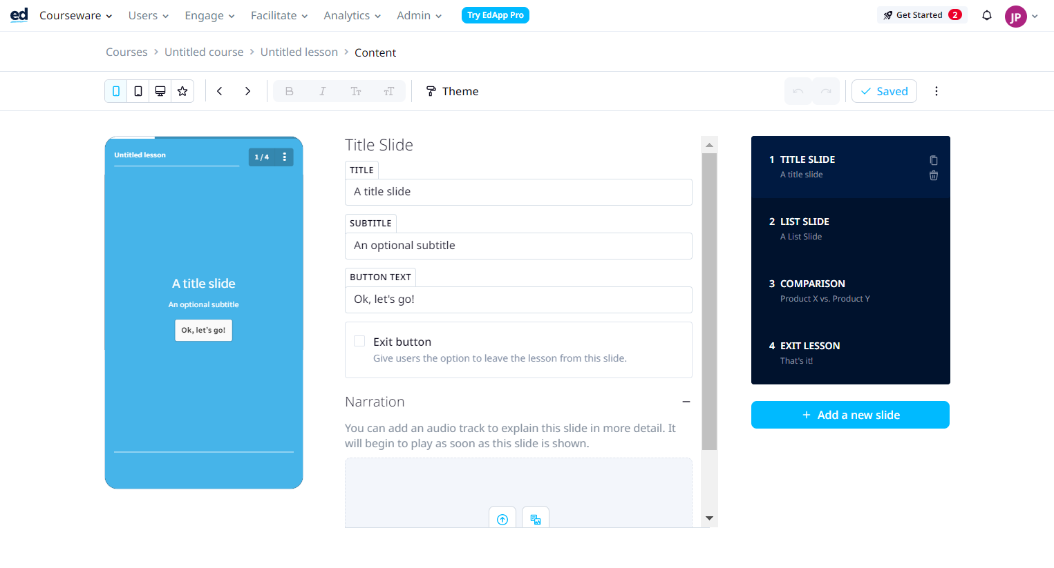
In EdApp, there are three levels of branding: Global, Course, and Lesson level. Typically, most authors add their CSS to the Course and Lesson levels. You can find the CSS input fields for Course and Lesson levels when you select Theme while at the Creator tool, make sure the ‘Apply Custom CSS’ checkbox is enabled and a text box will appear where you can enter your CSS.
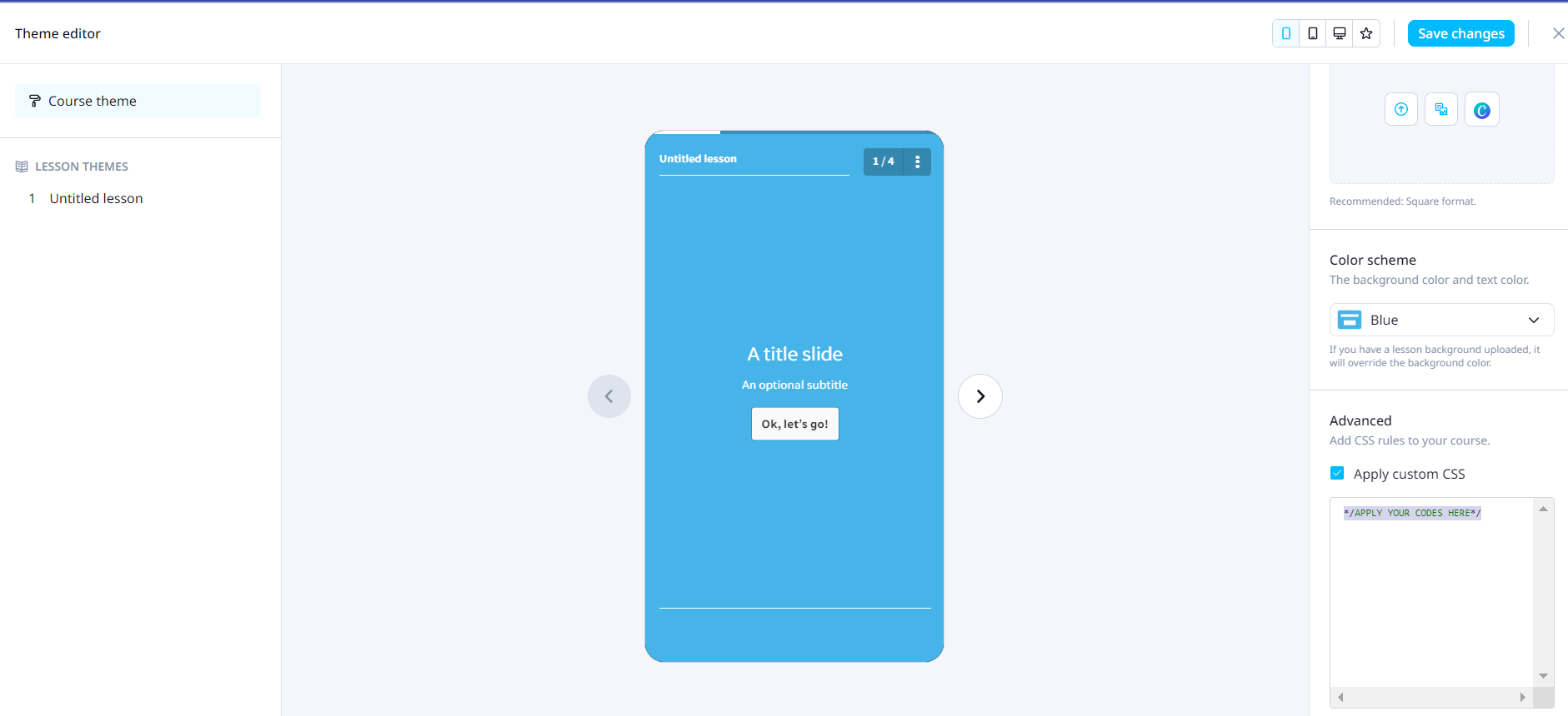
Global CSS is applied to all the new courses and lessons you make. This feature can be found in the ‘App Settings’ page under the ‘Content’ tab.
The Elements of Writing CSS
A simple line of CSS can be broken down into three major components, like the example below.
.elementname {
propertyname: value;
}
The ‘element name’ is where you would specify the element you want to customize. The ‘property name’ specifies what you would like to change and the ‘value’ specifies how you would like it to change. For example, if we wanted to change the indicator bar that appears at the top of each lesson. We would write:
#indicator {
background-color: lightgray;
color: rgb(219, 51, 52);
}
Here we’ve changed the two colors that appear on the indicator. We’ve chosen light grey as the static background color and red as the color that appears on top.
Notice how we’ve defined the property value ‘color’ with an rgba value instead of an actual color name? This is because the value of colors can be entered in many forms, such as RGB and HEX. You can learn more about it in this article: Colors Tutorial
You can target as many properties as you like as long as it’s supported by the device and is recognizable by the browser. We’ll cover the most common ones in this document.
The Symbols
Common mistakes for when beginners first write CSS is that they forget the following two symbols, without it your CSS won’t run properly.
- Curly brackets (“ { } ”)
All the elements of a lesson that you’re targeting within your lessons should be enclosed within a set of curly brackets.
- Semicolon (“ ; ”)
Don’t forget to finish each line of CSS with a semicolon.
In front of each element name you may have noticed a few different variations, the hash (#), fullstop (.) these are a more advanced syntax, which is used to denote classes and identifiers. For the purposes of this guide you won’t need to know anything about it.
Targeting the right elements
- Navigator
The following line changes the color of the Navigator that’s located at the upper right-hand corner of each lesson. (It displays the current slide number and the total amount of slides, as well as the menu button that’s denoted as three dots).
#lesson-header-nav {
background: rgba(31, 58, 147, 1);
}
Font
The style of fonts used within your lesson can be easily changed. Find your preferred font on Google Fonts. In the example below we’ve chosen the font ‘Volkhov’ and we’re selecting all the styles associated with that font family (regular, italic and bold).
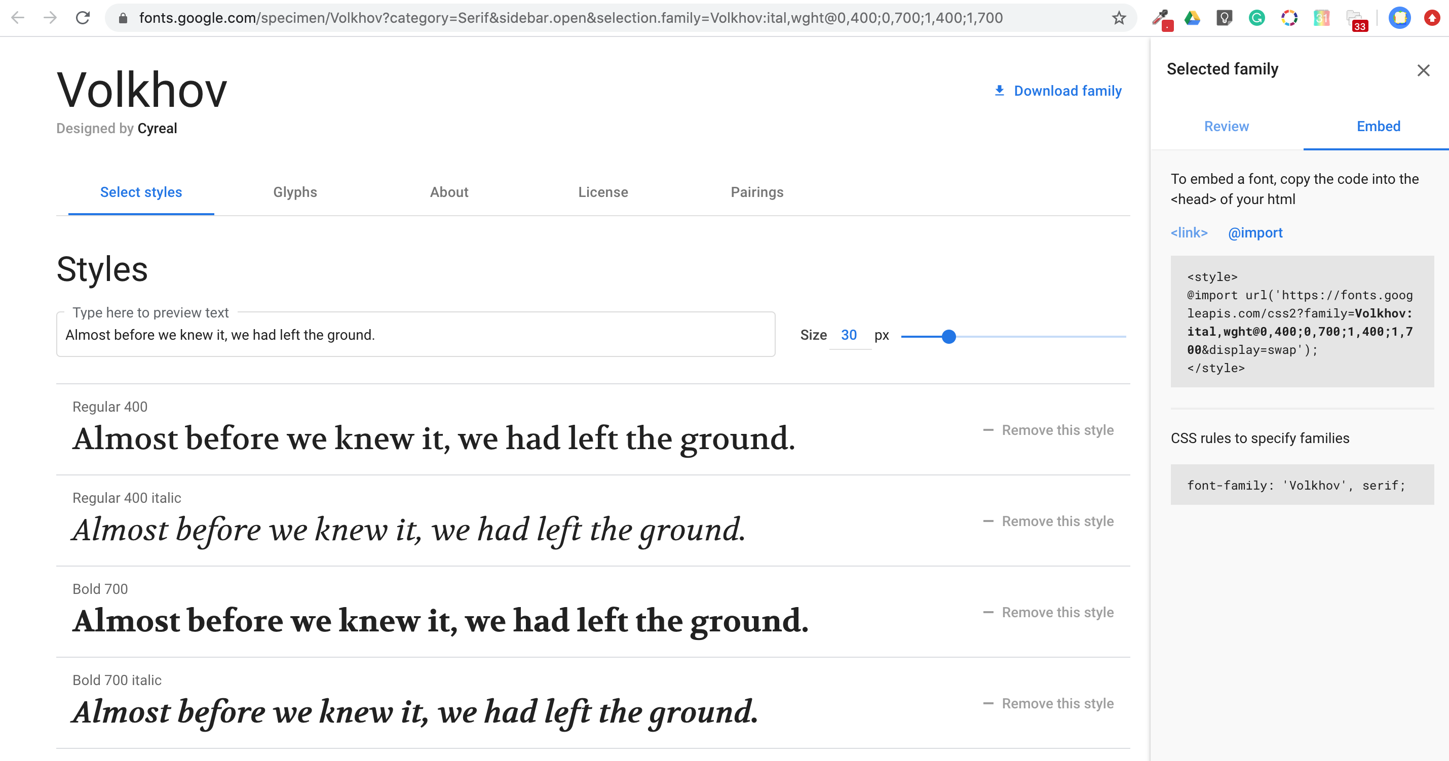
The next step is to click on the ‘Embed Tab’ on the right-hand side and copy the code for everything between the<style></style> tags.
(Note: We don’t need to copy the <style></style> tags because we’re directly pasting it into our Cascading Style Sheet, and not linking to it with HTML.)
Lastly, we need to paste the CSS into the ‘Custom CSS Rules’ text field.
@import url(‘https://fonts.googleapis.com/css2?family=Volkhov:ital,wght@0,400;0,700;1,400;1,700&display=swap’);
After linking to the font, we can begin to change the appearance of the text. To do this we’ll also write the following lines to target the body text. (The ‘body’ element will target all your text within the lesson. This is inclusive of headings and paragraphs. If you wanted different fonts for your headings and paragraphs you would have to target those two elements instead of body. For further reading check out the links at the bottom of the page.)
body {
font-family: ‘Volkhov’, serif;
}

Targeting specific elements
In this example we’ll look at changing the H4 headings to red, in this example we’ve used a hex colour instead of the correlating RGB value. We’ve also modified the font size using the numerical measurement of ems which is a relative measurement.
h4 {
color: #DB3334;
font-size: .8em;
}

Advanced CSS
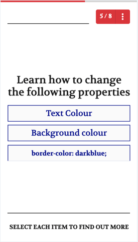
So far we’ve learned about changing the font, font color, font size, and background color.
There are many other properties we can target, here’s a short summary.
|
Effect |
Property Name |
|
Text Color |
color |
|
Background Colour |
background-color |
|
Shadow around element |
box-shadow ({box-shadow: 10px 10px grey;}) |
|
Transparency level of an element |
opacity (enter a number between zero and one) |
|
Roundness of corners |
border-radius (0px is right angles) |
|
Border type |
border-style (solid, dotted, dashed, inset, etc.) |
|
Border width |
border-width |
|
Border color |
border-color |
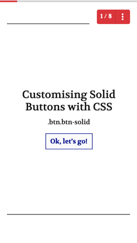
Solid Buttons
Let’s apply the following to our buttons. In the example below we’ve targeted solid buttons. It’s important to note that this will change the appearance of most templates. So do proceed with caution! Make sure you choose colors and styles that are easier on the eyes.
.btn.btn-solid{
color: darkblue;
border: solid 0.1px;
border-color: darkblue;
border-radius: 0px;
Here are a few examples of how it affects the following templates.
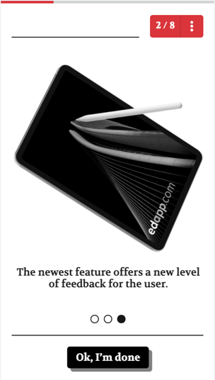
Muted Buttons (a.k.a ‘Okay, I’m done’ buttons)
The ‘Okay, I’m done’ button can also be customized, using the following lines of code.
.btn.btn-muted{
color: white;
background-color: black;
box-shadow: 10px 10px grey;
}
Additional Resources
Background Colours: https://cssreference.io/property/background-color/
Units of Measurement: https://www.w3schools.com/cssref/css_units.asp
CSS Properties: https://www.w3schools.com/cssref/