Making Your Content More Web Accessible
Accessibility is the key to creating training that’s inclusive to all types of learners!
Creating content that’s accessible is important because it allows all learners to effectively engage with your content, including those with disabilities, older people, and those who live in rural areas or developing countries. Some disabilities significantly affect how a person sees and distinguishes between colors, and others may require an audio or narration in order for the learner to fully comprehend the content at hand.
Making sure that our community of learners is socially inclusive is a priority of ours, so we’ve put together a list of the current options available in EdApp to Content Authors that will help to make your courses more accessible.
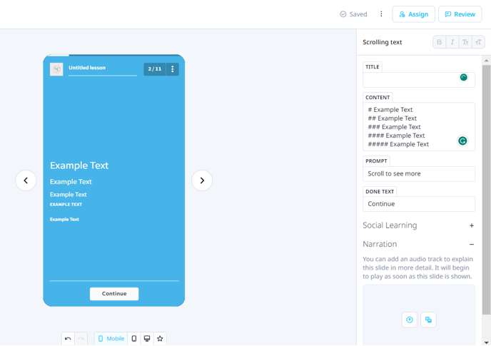
Increase Text Size for increased visibility: You might find that those with vision loss, and some older learners require large text, as normally most of us experience a decline in vision as we age. Using our Creator Tool, Content Authors can easily increase text size so that those with visual impairments won’t have to strain to read lesson content. Additionally, because our system supports CSS, authors are welcome to drop in some CSS formatting and rules, which can really help to style text so that it will appear to the learner in the way it was intended to be seen. This can be achieved by using hashtags (#) as seen below.
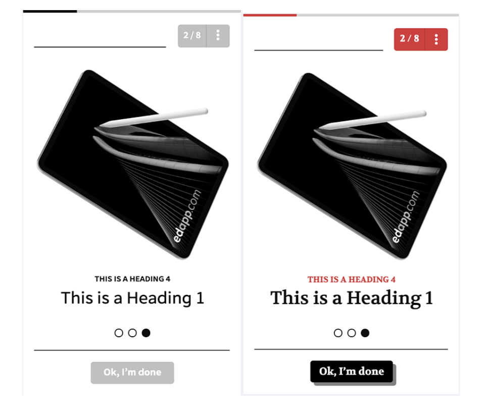
Adjust Text Color to Ensure Good Contrast: Many of those with limited vision, or who are older, find it difficult to distinguish between colors - or, depending on the level of impairment, may not be able to see color at all. For these reasons, it’s critical that Content Authors use a good contrast in their lessons. A good contrast means there must be sufficient contrast between text color and its background so that people with low contrast sensitivity or color blindness would be able to easily read lesson text. In EdApp we offer high-contrast color schemes, right from the Course Branding tab. Additionally, Content Authors can find the right contrast by using CSS to adjust colors in text, background, and even some key buttons that allow users to progress from slide to slide. Please check this guide on custom css to achieve this.
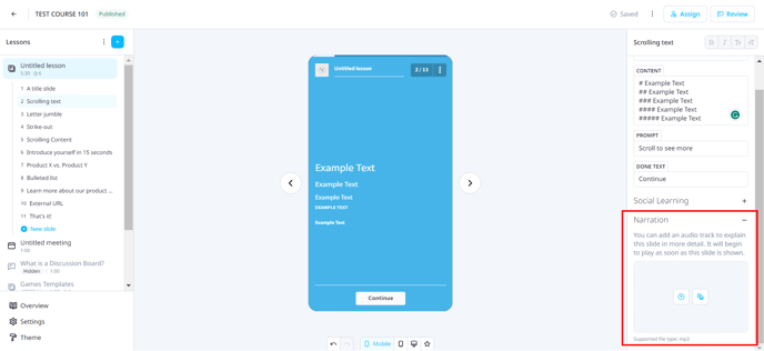
Use Narration When Possible: Learners who have cognitive or learning disabilities, or those who cannot see videos adequately would benefit from the use of narration, or audio description. In EdApp, our content slide templates allow for narration (with the exception of Image Map, Peer Authoring, and Speech Bubble slide templates). Content authors can upload audio files that describe the content on each slide, which can boost comprehension for any learners who have trouble processing visual content alone. Additionally, our Media Template slide template allows authors to display content using images, video, and audio narration all in the same slide, so that your learners can fully access and understand the content at hand.
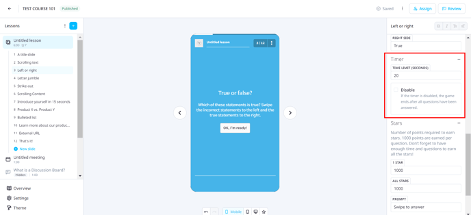
Adjust or disable the timer on gamified slides: All slide templates in the Games category include a built-in timer that’s defaulted to 20,000 milliseconds, as this timing is optimal for most learners. However, those with lower visual processing speeds or reading levels will likely find this timing to be extremely difficult. They may only get to view and answer a small fraction of the quiz questions in the slide before running out of time, which is far from an ideal learning experience. For this reason, Content Authors can easily extend, or disable timers altogether, so that all learners can complete the challenge at their own pace.
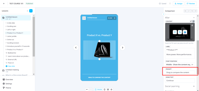
Use labels or instructions where user input is required: Interaction is a critical learning tool that many of our slide templates utilize. Whether swiping through imagery in our Image Slider template, or “scratching” one piece of key information to reveal related key information below, or reviewing bulleted points that expand with more detailed information upon touch, learners must receive clear instructions on how to interact with their device screens to proceed to the next lesson. Our slide templates are ready-made with defaulted user prompts that are clearly defined, but Content Authors also have the ability to customize the text for user prompts and buttons to ensure that clear directions are provided whenever content requires user input.
It’s a priority of ours to make sure our community of Content Authors knows how to utilize our features and templates to build and design gorgeous content that’s effective and engaging. We understand the importance of making sure your training program is one that all learners can access and benefit from, and that no one is excluded from the learning experience you create.
REFERENCES: Web Content Accessibility Guidelines (WCAG) Overview https://www.w3.org/WAI/standards-guidelines/wcag/