![EdApp - logo dark mode-1.png]](https://support.edapp.com/hs-fs/hubfs/EdApp%20-%20logo%20dark%20mode-1.png?height=40&name=EdApp%20-%20logo%20dark%20mode-1.png)
Check out this article for more information on the basics of CSS.
Contents
Fonts and Texts
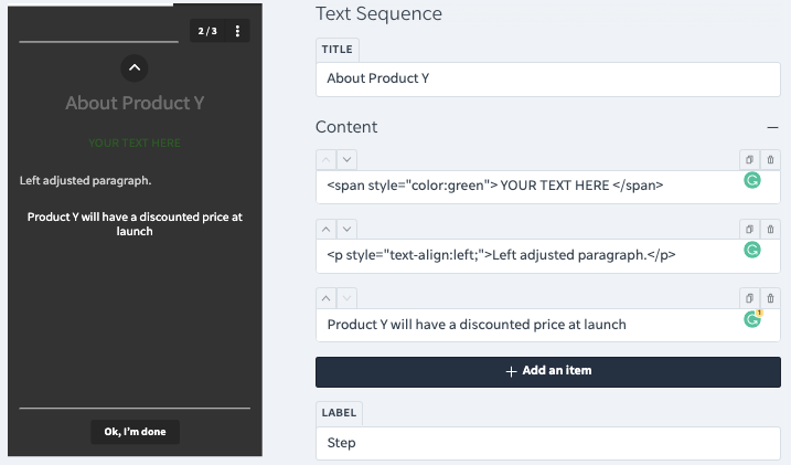
Text colour in a lesson
<span style="color:#54585A"> YOUR TEXT HERE </span>
Text alignment
<p style="text-align:center;">Centered paragraph.</p>
The following must be applied to the individual text fields within the lesson.
See the article on markdowns for more information.
Change Fonts
body {font-family: "Calibri", sans-serif; }

h1, h2, h3, h4, h5, h6 {font-family: "Calibri", sans-serif;}

p {font-family: "Calibri", sans-serif; }
- This sets the font for content and headings to Calibri (without serif which is a style of text)
- Custom fonts need to be hosted externally then imported.
- h1, h2 etc refers to the headers. H1 is the biggest header, H2 is the second biggest etc.
Buttons
Main buttons within the lesson
.btn.btn-solid {
   color: #fff;
   border: 1px solid rgba(0,0,0,0.2);
   background-color: #FFCC33;
   background-clip: padding-box;
}
 Secondary Buttons
/*ok im done*/
.btn.btn-muted {
background-color: green;
color:orange;
border-radius: 10px;
}
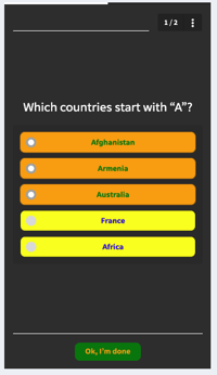
/*selected buttons*/
.selectable.active .btn {
background: orange;
color: green;
}
/*unselected buttons*/
.btn.btn-solid {
background-color: yellow;
color:blue;
}
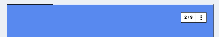
Menu button on the top right
/*slide number box top right*/

#lesson-header-nav{
background: blue;
color: yellow;
border-radius:10px;}
Progress bar colour
#indicator {
   color: #803d9a;
   background-color: rgba(0, 0, 0, 0.20);
}
This refers to the bar at the top of the lesson as you progress through completion.
Takeaway pop-up
#slide-answer {
   border-bottom: 20px solid #000;
   border-top: 4px solid #000;
   color: #fff;
   background-color: #FFCC33;
   background-image: none;
}
CSS Properties
background all background properties in one declaration
background-color background color
background-image background image
border-style ADD dotted, dashed, solid, double, groove, ridge, inset, outset
border-bottom-color color of the bottom border
(bottom can be replaced with "left" "right" or "top")
border-color border color
border-width border width
border-radius roundness of corners (0px is right angles) (use percentages to make oval-shaped)
box-shadow creates shadow from element ex (10px 10px grey;)
color text color
display: inline-block make a block around text (like Image Slider)
filter image effects: grayscale, blur, invert etc.
font all font properties in one line
@font-face declare non-web-safe fonts
font-family font of the element
font-size font size
font-stretch widen or narrow text
font-style font style: normal, italic, oblique
font-weight use bold or thin characters
height height of the element
justify-content justifies flexible container's items horizontally if necessary
letter-spacing space between characters
linear-gradient (angle, color-stop1, color-stop2)ex. (to right, orange, black) (use with BGimage)
line-height line height of text or inline-block elements
list-style all list properties in one line
opacity transparency level of an element
padding padding between the element border and content
padding-bottom padding bottom
(bottom can be replaced with "left" "right" or "top")
text-align horizontal alignment of text
vertical-align vertical alignment
For further reading on CSS and more info about what each of the above properties target check out: https://www.w3schools.com/css/default.asp