How to Create Graphics with Limited Design Skills
This guide will help you in finding and selecting the appropriate imagery for your lessons.
Simplicity is key
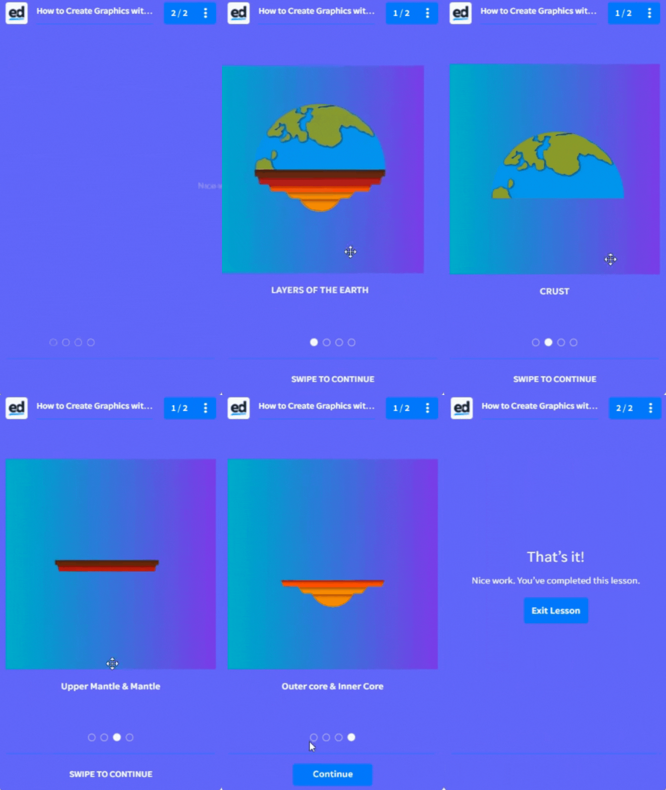
A great microlesson doesn’t need complex imagery, such as long-formed complex infographics that are seen everywhere on the web. Instead, break them down into bite-sized pieces of information and disperse them throughout the slide. Avoid text in images where possible, as this doesn’t translate well and can be hard to see on different screen sizes. This is dependent on the amount of text on the image and the font size.

Choose a consistent colour scheme
If you choose to use icons or stock photos choose a consistent colour palette or style to keep everything looking cohesive. This is because any element (such as the line weight, and background colours) within the picture that stands out will detract from the lesson itself. Although you can use this to your advantage, using highlight colours to bring attention to important information.
When sourcing icons we recommend sticking to the same author or design for the collection and this will help in creating a unified look. FlatIcon is a great place to find vector-based icons, they offer an in-browser colour editor so you can customise the colours for your icons.

Course aesthetic
Make sure your content stands out against the background, and that the colours don’t clash or blend in making it hard for your learners to read. (See Creating Backgrounds for some examples of good and bad backgrounds.)
Additionally, you can use our Canva integration feature to help you with all your image editing needs, they have a comprehensive stock photo library available for you to browse. Experiment with their filters and adjustment features (such as blur, tint, brightness and contrast), to achieve your desired effect.