There are multiple touchpoints where you can add a customised and unified look to match your organisation’s branding. These are the splash screen, banners and course level branding. We’ll cover each of these in more depth later on but first let’s take a look at the golden rules that apply across all three elements.
Course Branding
Firstly, simplicity is key. Keep colours consistent with company colours and use a select amount of colours for consistency. Second, make sure text is easily legible. Choose images with depth and negative space to make the logo and text easier to read. If necessary use the Canva image editing feature to blur, darken or tint the background image. It also helps if the images have depth and negative space, as it’ll make the logo and text easier to read. See this article for more information on creating a course background.
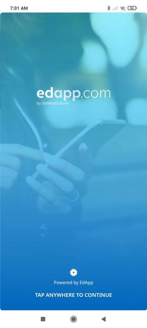
Splash Screen
The splash screen is the first thing a learner sees upon signing in, it’s a great place to add imagery to get your learners excited for the learning programs to come. The background image stretches responsively across the whole screen. Since the logo appears in the top, center portion of the screen, the focal point should align across the bottom portion following the rule of thirds.
Banners
Banners are a great opportunity to display important messaging, such as company updates. It appears above the course feed, it’s recommended that you use contrasting colours to get your learner’s attention. Examples of this include the distinct background colours, or images with a strong focal point.
Recommended image dimensions: 1280 x 720px (aspect ratio 16:9). Learn more about how to configure your banner here.
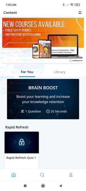
Optionally, hyperlinks can be added to take the learner to a webpage. If there’s text in your banner image, make sure it’s also legible on mobile devices, and use visual cues to indicate that the banner link is interactive.
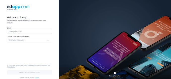
Custom Signup Page
Registration branding can be used in order to give your user a customized experience. The custom signup page is the first thing a user sees once they click on the invite link or enter an invite code when signing up.
Recommended logo dimensions: PNG, maximum size of 5MB, 180 x 180 px.
Recommended background dimensions: JPG, 2000 x 2000 px.
Learn more about how to customize the signup page here.